


Showcase
A new brand. A new look.
PHI (PARAPROFESSIONAL HEALTHCARE INSTITUTE)
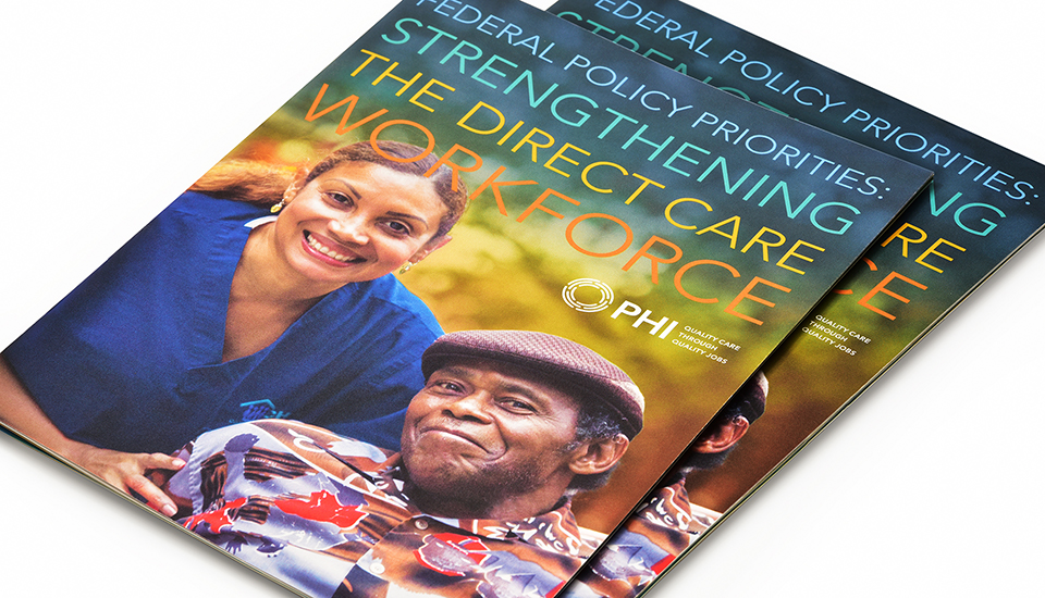
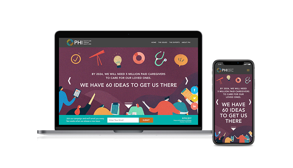
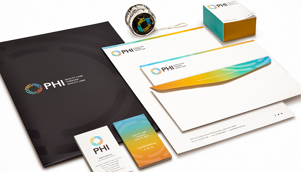
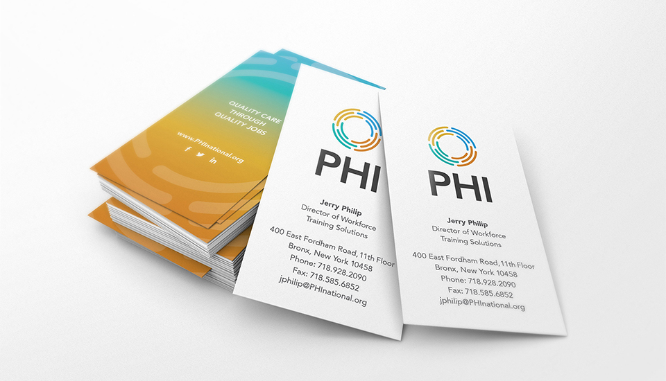
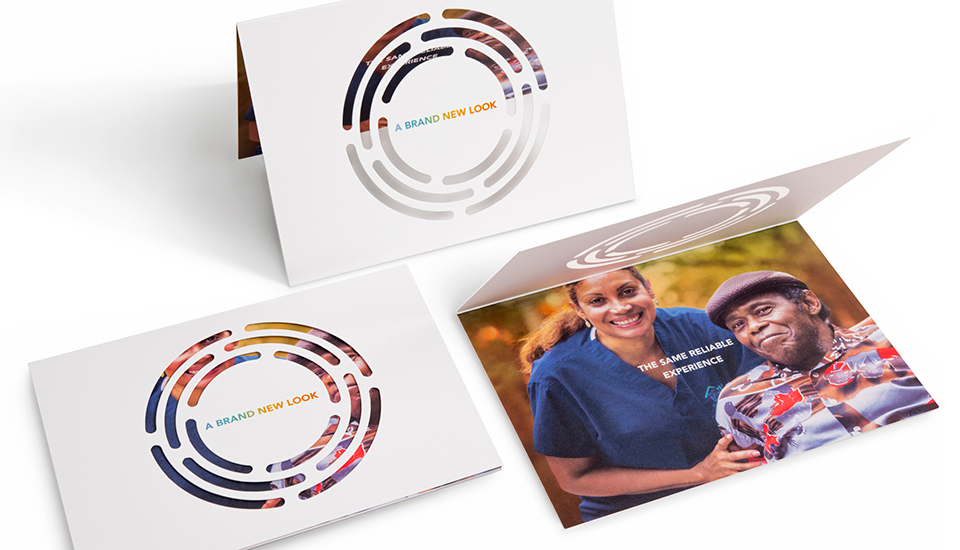
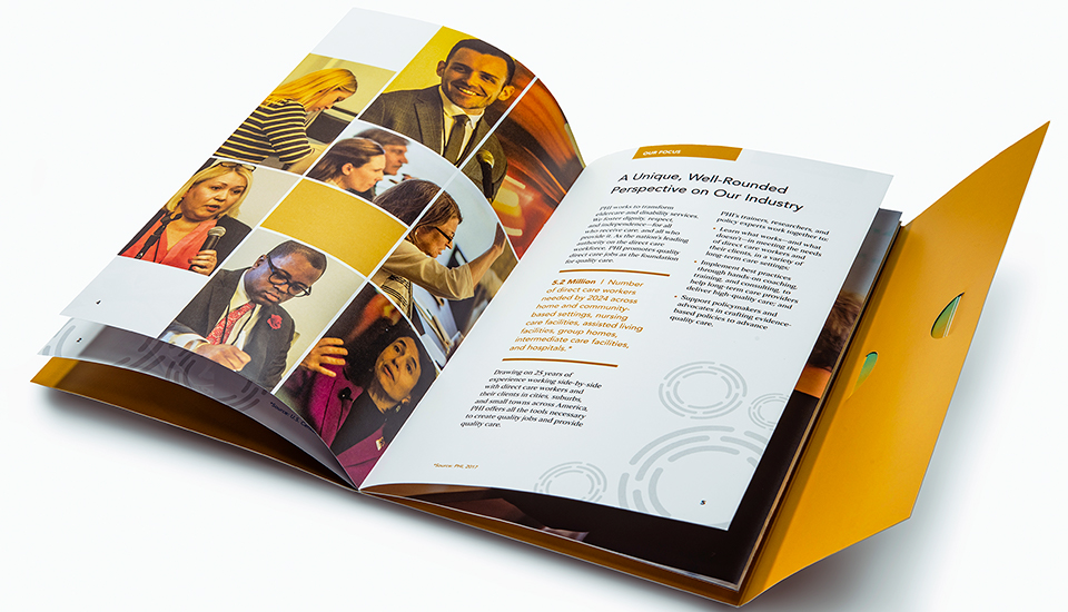
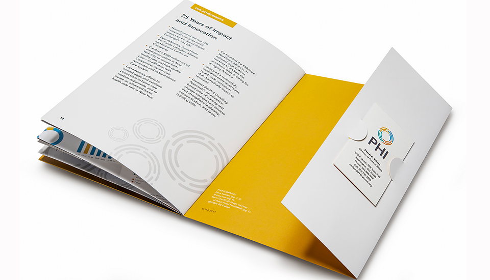
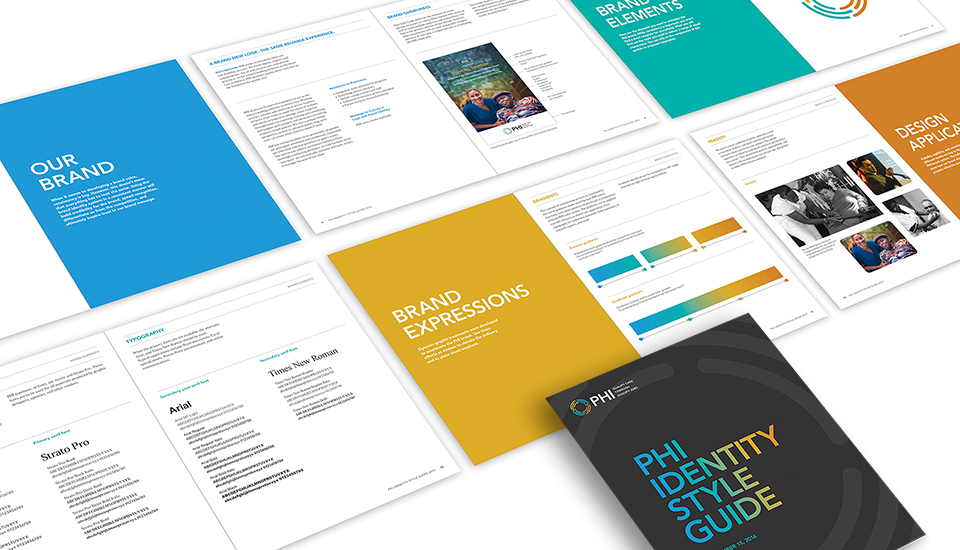
Here’s a shining example of the transformative power of design. PHI, the leading authority on the home care workforce, asked us for help to strategically re-position its brand to sharpen and humanize its image and to give the organization an instantly recognizable visual identity. We began by designing a unique new “circles within circles” logo to symbolize PHI’s multiple, interacting services. We introduced a new, brighter color palette, a more contemporary typeface, and imagery that focussed more on the human factor. The result is a vibrant new look that projects PHI’s dual personality: on one hand, rigorous, research-based, intellectual, on the other, warm, human, inviting. PHI’s makeover is remarkable. While preserving and enhancing its reputation as a leading authority in its field, we have revitalized PHI with a bold, new, contemporary – and optimistic spirit. Past and present are conjoined. And a new brand is born.